15 Top Trends & Colors 2019 - Antron

Die Seite wird erstellt Ava Ebert
 
WEITER LESEN
15 Top Trends & Colors 2019 - Antron
© 2019 INVISTA. All rights reserved. Antron® and the Antron® family of marks and logos are trademarks of INVISTA.

                                                                                                                    INVISTA (Deutschland) GmbH
                                                                                                                    Philipp-Reis-Str. 2
                                                                                                                    65795 Hattersheim am Main

                                                                                                                                                 15 Top Trends & Colors 2019
                                                                                                                    Germany
                                                                                                                    www.antron.eu
15 Top Trends & Colors 2019 - Antron
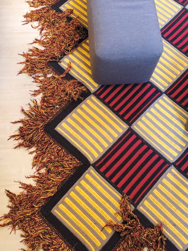
Interior trends go beyond color and shape. From the natural environment
           to evolving technology, different facets of modern life are becoming

TOP15
           increasingly interwoven and reflected back to us in new ways via our living
           spaces. For instance, nature and plants seem ubiquitous in the home,
           while mysticism is bubbling back to the surface. Global craft heritage is
           resurfacing at the same time as technology, science and light are aiding

TRENDS &
           immersive design. A glam ‘80s revival is coinciding with celebrations of
           timeless design. These diverse, rich narratives coalesce and translate
           into interesting color perspectives, captured for you in this compact

COLORS
           Milan report. Each trend summary is a snapshot of discoveries
           uncovered at the Salone and Fuorisalone exhibits.

2019
           Einrichtungstrends losgelöst von Farben und Formen. Verschiedene
           Facetten des modernen Lebens - von der natürlichen Umwelt bis hin zu
           neuen Technologien - fließen ineinander über und werden über unsere
           Lebensräume reflektiert. Pflanzen sind allgegenwärtig und Mystik tritt
           an die Oberfläche. Weltweit wird handwerkliches Erbe wiederentdeckt,
           während Technologie, Wissenschaft und Licht immersives Design fördern.
           Die 80er leben wieder auf, gleichzeitig wird das zeitlose Design gefeiert.
           Diese vielfältigen und opulenten Darstellungen verschmelzen in
           interessanten Farbperspektiven, die wir in diesem kompakten Bericht
           von der Milan Design-Week 2019 für Sie zusammengefasst haben.
           Jede Zusammenfassung des Trends ist eine Momentaufnahme der
           Entdeckungen bei den Ausstellungen Salone und Fuorisalone.

                                                                                         01
15 Top Trends & Colors 2019 - Antron
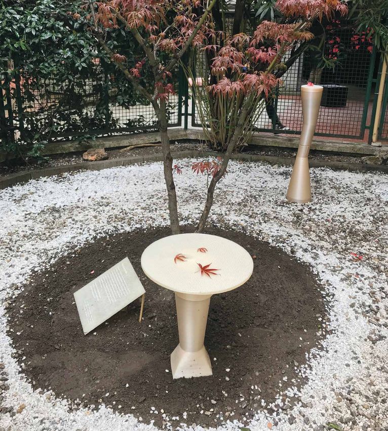
“Algae Geographies” by Algae Platform
     for the “Broken Nature” exhibition at the
     Triennale. Design: Klarenbeek & Dros in
     collabotation with Atelier Luma
     Photography: Antoine Raab / Luma Foundation.
                                                                           01
                                                    “Adjacent Fields” installation by
                                                    Australian artist Linda Tegg at
                                                    Jil Sander’s headquarters in Milan.
                                                                                                                                               “Keeping Life” exhibition by CIAM
                                                                                                                                           in collaboration with Francesca Sarti
                                                                                                                                                                       at Alcova.

         A lot of projects were about
         creating a collaboration
                                                                                          CHLOROPHYLL
         between natural phenomenons                                                       In vielen Projekten ging es darum, ein
         and science to answer human                                                       Zusammenwirken zwischen Natur und
         needs without destroying the                                                      Wissenschaft zu initiieren, um menschlichen
         environment. Plants, in particular,                                               Bedürfnissen gerecht zu werden, ohne die
         are precious allies to design                                                     Umwelt zu zerstören. Insbesondere Pflanzen
         sustainable projects.                                                             sind wichtig für das Realisieren nachhaltiger
                                                                                           Projekte.
         From fertile ground, nature grows
         and thrives. The Plants Kingdom                                                   Auf fruchtbarem Boden wächst und gedeiht
         and its infinite palette of greens                                                die Natur. Das Pflanzenreich und seine
         is our best hope for a breathable                                                 unendliche Palette an Grüntönen ist unsere
         and luxuriant future.                                                             Hoffnung für eine lebenswerte Zukunft.
02                                                                                                                                                                     03
15 Top Trends & Colors 2019 - Antron
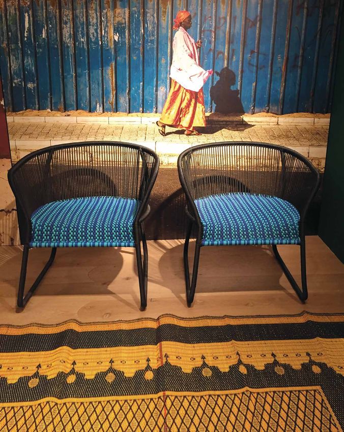
Once again, 3D printing had a strong
                                   presence. But it seemed more authentic

02
                                   now, as if the medium were finally becoming
                                   accepted within the natural design
                                   language. Printed structures appeared in
                                   white or beige, with colors notably
                                   omitted, and were often placed in dialogue
                                   with natural elements.

                                   These examples show that new technologies
                                   don’t have to replace nature. Instead, they
                                   can complement and highlight it. In fact,
                                   combining the two approaches may be one
                                   way to build a sustainable future.

  NATURALLY PRINTED
“Conifera” by Mamou-Mani for COS
at the Palazzo Isimbardi.

                                                                                                                       “Breathe In / Breathe Out” by crafting plastics!
                                                                                                                studio and Office Moritz Maria Karl at Alcova Sassetti.

                                                                                 Der 3D-Druck machte weiterhin von sich reden.
                                                                                 Er wirkte nun authentischer, fügte sich mehr
                                                                                 in die natürliche Designsprache ein. Gedruckte
                                                                                 Strukturen erscheinen in Weiß oder Beige,
                                                                                 bemerkenswert farblos, und stehen oft in
                                                                                 Dialog mit natürlichen Elementen.

                                                                                 Diese Beispiele zeigen, dass neue Technologien
                                                                                 die Natur nicht zwangsläufig ersetzen.
                                                                                 Vielmehr ergänzen und betonen sie sie. Die
                                                                                 Kombination beider Ansätze könnte den Weg
                                                                                 zu einer nachhaltigen Zukunft weisen.

     04                                                                                                                                                                   05
15 Top Trends & Colors 2019 - Antron
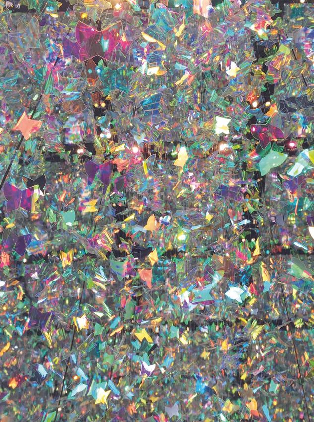
Playfulness occurred with saturated
             colors, inspired by African craft
             as well as indigenous products of
             Africa. This was visible in bold
             geometrics alongside wild fringe,
             intricate jacquards and two-tone
             weaves.

             The resulting palette full of contrasts
             is composed of primary basics,
             spreading positive energy and an
             atmosphere of play and joy.

                                                              “Summit Suite” walls
                                                          by Sunbrella x Liz Collins
     “M’Afrique” collection by Moroso.                               x Ligne Roset
                                                       at Galleria Rossana Orlandi.

                                                          AFROTOPIA
                                                                                                                                  “Summit Suite” carpet by
                                                                                                                        Sunbrella x Liz Collins x Ligne Roset
                                                                                                                                at Galleria Rossana Orlandi.

                                                          Fröhlichkeit in satten Farben, inspiriert von afrikanischem
                                                          Kunsthandwerk und typischen afrikanischen Produkten.
                                                          Geometrische Formen neben wildem Besatz,
                                                          verschlungene Jacquards und zweifarbige Gewebe.

                                                          Die sich daraus ergebende Farbpalette ist voller Kontraste
                                                          aus den Grundfarben. Sie verströmt eine positive Energie
                                                          und eine Atmosphäre spielerischer Freude.
06                                                                                                                                                  07
15 Top Trends & Colors 2019 - Antron
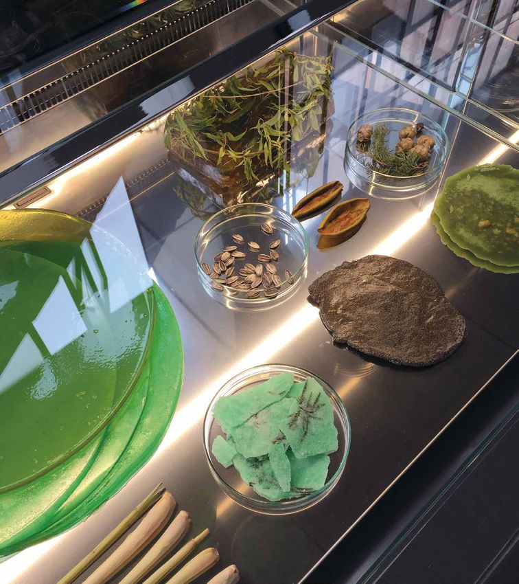
The star color aspects of the show, dichroic iridescence and reflections
were extremely Instagrammable. Showcasing dynamic shades, this                                                      Eines der herausragendsten
material revealed a color palette by way of its movement.                                                           Farbeffekte der Show - dichroitische
                                                                                                                    und irisierende Reflektionen - waren
When interspersed with light, dichroic surfaces and objects generate an                                             äußerst “instagrammable”. Die
evanescent and opalescent color palette, adding magic to everyday life.                                             Materialien zeigen in der Bewegung
                                                                                                                    ihre Farbpalette und dynamischen

DICHROIC
                                                                                                                    Schattierungen.

                                                                                                                    Dichroitische Oberflächen
                                              “Resonance” exhibition by Samsung                                     und Objekte erzeugen, wenn
                                                                 in Zona Tortona.                                   sie angestrahlt werden, eine
                                                                                                                    vergängliche und schimmernde
                                                                                                                    Farbpalette und verzaubern
                                                                                                                    so den Alltag.

                                                                                                                                      “Diamante” lamp by LESYEUX
                                                                                    “A Pinnacle Of Reflection” by                               at Ventura Future.
                                                                                    3M Design and Matteo Thun
                                                                                    in Zona Tortona.

08
                                                                                            04                                                                       09
15 Top Trends & Colors 2019 - Antron
Designers played a lot with terrazzo in

                                                                                                                          05
              various exhibitions. From sculptures to
              flooring, the terrazzo technique was even
              injected into textiles. Combining materials
              together without concealing the variety of
              sources made a new sustainable statement.

              Terrazzo is evidence of a need to reuse
              materials and give them several lives. Its
              mélange look brings together materials,
              colors and textures that had previous uses
              into one entity.

     “Nuances” line rug by Patricia Urquiola for Gan Rugs.   “Cap Martin Sunset” table by Carlo Colombo for Cappellini.

                                                             TERRAZZO
                                                                                                                          “Formations” exhibition by Note
                                                                                                                               Design Studio for Tarkett in
                                                                                                                           collaboration with Magis at the
                                                                                                                                    Brera Design District.

                                                             Designer “spielten” bei der Show nach
                                                             Herzenslust mit Terrazzo. Nicht nur
                                                             skulptural und für Fußböden wurde
                                                             die Terrazzo-Technik verwendet auch
                                                             in Textilien. Die Kombination von
                                                             Materialien, deren Ursprung sichtbar
                                                             ist, gibt ein neues Statement zur
                                                             Nachhaltigkeit.

                                                             Terrazzo ist der Beweis für die
                                                             Notwendigkeit, Materialien
                                                             wiederzuverwenden und ihnen
                                                             neues Leben zu schenken. Sein
                                                             Melange-Look vereint Materialien,
                                                             Farben und Texturen, die früher
                                                             verwendet wurden, zu einer
10                                                           neuen Einheit.                                                                      11
15 Top Trends & Colors 2019 - Antron
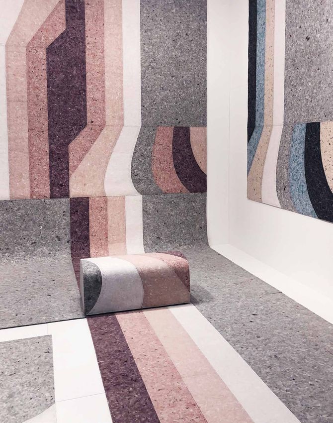
Mineral references were omnipresent during the
     show, hinting at spirituality and mysticism. Microcosm
     exhibitions were used as a means to escape reality and
     revealed a supernatural pastel palette.

     In this case, imagination draws from the real world in
     order to escape it. This palette is based on a reinvented
     vision of nature, creating a dreamlike and comforting
     atmosphere.
                                                                 “Les Arcanistes” exhibition by
                                                                 Studiopepe in Porta Venezia.

     MINERAL PASTELS

                                                                                                                                  06
                                                                                                                 “Tides” exhibition by Wang & Söderström
                                                                                                                 and Kwangho Lee, presented by NOROO
                                                                                                                 at Ventura Centrale.

                                                                                                        Bezug zum Mineralischen waren während der Show allgegenwärtig
                                                                                                        und wiesen auf eine gewisse Spiritualität und Mystik hin. Gestaltete
                                                                                                        Mikrokosmen dienten als Mittel, um der Realität zu entkommen,
                                                                                                        und bestachen durch eine fast übernatürliche Pastellfarbpalette.

                                                                                                        In diesem Fall schöpft die Vorstellungskraft aus der realen Welt,
                                                                                                        um dieser zu entkommen. Diese Palette basiert auf einer neu
                                                                                                        erfundenen Vision der Natur und schafft eine traumhafte und
                                                                                                        beruhigende Atmosphäre.
12                                                                                                                                                                             13
                                                                   “Guise” collection by Odd Matter
                                                                    at FAR exhibition. Nilufar Depot.
15 Top Trends & Colors 2019 - Antron
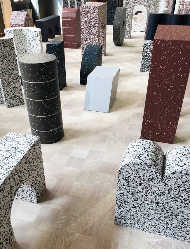
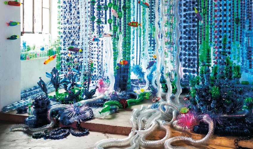
The question of how to handle plastic waste was raised
     all around Salone. Many designers are still searching for
     solutions to reuse, recycle or give new life to plastic, but
     rose to the challenge of using this colorful raw material in
     design.

     How to manage plastic waste has been discussed for
     some time, and we are yet to find a solution. But we must
     get used to this new vivid plastic palette, because it will
     feature as much in our future as it did in the past.
                                                                    Der Umgang mit Plastikabfällen trieb viele Designer um.
                                                                    Während einige noch nach Lösungen suchen um alten
                                                                    Kunststoffen neues Leben zu geben, stellen sich
                                                                    andere schon der Herausforderung, dieses farbenfrohe
                                                                    Rohmaterial in Designobjekten zu verwenden.

                                                                    Eine zufriedenstellende Lösung im Umgang mit Plastikmüll
                                                                    steht noch aus, aber gewöhnen wir uns jetzt an die
                                                                    leuchtende Plastik-Palette, denn sie wird in Zukunft
                                                                    ebenso wichtig bleiben wie bisher.
                                                                                                                               07
     “The bottle fisherman” installation by Arsenio Rodriguez
     at Galleria Rossana Orlandi.                                   THE PLASTIC ISSUE

14                                                                                                                              15
15 Top Trends & Colors 2019 - Antron
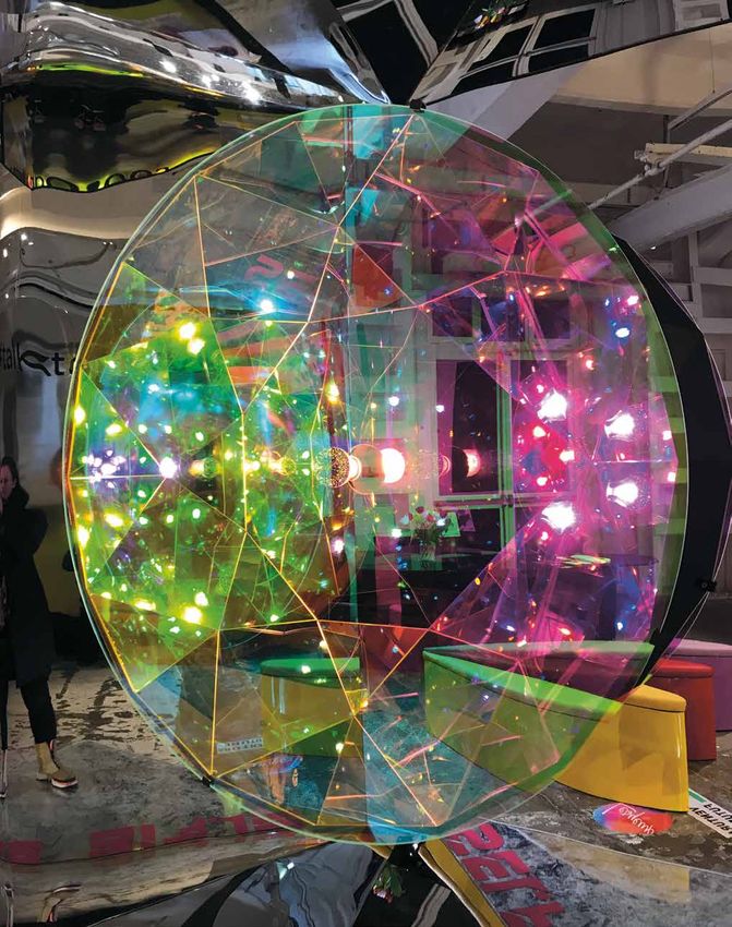
Many exhibitions offered respite within the busy Salone surroundings.
Ephemeral light, shadow effects and refined shades of whites created a quiet
atmosphere in which to appreciate design, resulting in a tranquil state of mind.

Calm, blank spaces in soothing whites allow us to take pause and reflect on
our values and priorities. They deliver on our need for sanctuary in a hectic
world full of movement and change: a place where we can switch off from the
information overload in our daily lives.

SANCTUARY WHITES
                                                                                                     08
                                                                     “Waste No More” installation by Sigi Ahl
                                                                and Eileen Fisher at Galleria Rossana Orlandi.

                                                                                                                                        “Les Arcanistes” exhibition by Studiopepe
                                                                                                                                        at Ventura Centrale.

                                                                                                                 In der belebten und hektischen Umgebung des Salone boten viele
                                                                                                                 Ausstellungen eine Inseln der Ruhe. Flüchtiges Licht, Schatteneffekte
                                                                                                                 und subtile Weißtöne schufen eine sanfte Atmosphäre, in der das
                                                                                                                 Design eine beruhigende Wirkung hat.

                                                                                                                 Stille, leere Räume in sanftem Weiß ermöglichen Besinnung sowie
                                                                                                                 Nachdenken über unsere Werte und Prioritäten. Sie bieten uns
                                                                                                                 Zuflucht vor der hektischen, immer im Wandel befindlichen Welt,
                                                                                                                 und lassen uns der Informationsflut vorübergehend entkommen.

                                                                                                                                    “MATERIALMESSAGE” installation
                                                                                                                                       by Snarkitecture for LAUFEN.

16                                                                                                                                                                                       17
“Halo” installation by Mandalaki Studio in collaboration
     with Bang & Olufsen.
                                                                09
                                                                                      “Tides” exhibition by Wang & Söderström
                                                                                      and Kwangho Lee presented by NOROO
                                                                                      at Ventura Centrale.

     This year, designers lent heavily on light

                                                                                      LIGHT SHOW
     installations a way of experimenting with
     color shades.

     The colors formed by lights can be seen
     but not touched. They create an intense                                          In diesem Jahr experimentierten viele Designer mit
     and immersive palette and an intangible                                          Farbtönen durch den Einsatz von Lichtinstallationen.
     experience for the viewer, which can be
     equally as engaging in the home as it is                                         Die vom Licht gebildeten Farben sind sichtbar, aber
     in the exhibition space.                                                         nicht berührbar. Sie erzeugen eine satte, immersive
                                                                                      Palette und immaterielle Erfahrungen für den Betrachter,
                                                                                      die zu Hause ebenso prägnant und eindrucksvoll sind
                                                                                      wie auf der Ausstellung.
18                                                                                                                                               19
                                                                 “Halo Big” lamp by
                                                                  Mandalaki Studio
“ExCincere” collection of volcanic
                                                                                                              ash-glazed porcelain tiles
                                                                                                                     by Formafantasma
                                                                                                                     for Dzek at Alcova.

                                                               Ground and soil used in their
                                                               raw state were highly visible as
                                                               inspiration for this year’s show.
                                                               Whether volcanic ashes, soil samples
                                                               or soil spread on the floor, earth

                                                                                                        GROUND
                                                               matter was encountered in various
                                                               forms.

                                                               Connecting us back to the earth,
                                                               these tactile brown shades are
                                                               warm and comforting. It’s time to

10
                                                               embrace getting our hands
                                                               dirty – by plunging them in fertile
“Keeping Life” exhibition by CIAM                              ground.
in collaboration with Francesca Sarti
at Alcova.

                                                                Erdige Materialien in ihrer
                                    “No Man’s Land”             ursprünglichen Form waren dieses
                                    exhibition by Raf Simons
                                    and Kvadrat at              Jahr Quelle der Inspiration. Ob als
                                    Garage Ventuno.             vulkanische Asche, in Form von
                                                                unterschiedlichen Boden-Proben
                                                                oder auf dem Boden verteilt. Das
                                                                Thema wurde in vielfältiger Weise
                                                                interpretiert.

                                                                Diese greifbaren braunen Farbtöne
                                                                sind warm und beruhigend,
                                                                verbinden sie uns doch wieder mit
                                                                Mutter Erde. Es ist an der Zeit, die
                                                                Ärmel hochzukrempeln und die
                                                                Hände in fruchtbaren Boden zu
                                                                stecken.
      20                                                                                                                                    21
Ethnische Inspirationen und das Handwerk
                                                                                                                    waren dieses Jahr allgegenwärtig. Tradition
                                                                                                                    in zeitgenössischem Gewand bewies so
                                                                                                                    wieder einmal, dass traditionelle, ethnische
                                                                                                                    Designs wahre Klassiker sind.

                                                                                                                    Der neue ethnische Look behält seinen
                                                                                                                    rauhen Charme, zeigt aber eine sorgfältig
                                                                                                                    ausgewählte Farbpalette. Authentische
                                                                                                                    Details in Balance mit dezenter
                                                                                                                    zeitgenössischer Ästhetik.

                                                                                                                                              “Raw Material” show by Hermès
                                                                             “Savanna” mask by Tiphaine de Bodman                                               at La Pelota.
                                                                             for ILO Rugs.

     “Tangle Medan” rug by Claire Vos
     for Moooi carpets.

          NEO-ETHNIC
          Ethnic inspirations and indigenous crafts were ever-present.
          This year they were revived in a calm and contemporary way,
          reaffirming how traditional ethnic designs are true classics.

          The new ethnic look keeps its raw edge but shows a carefully
          selected color palette. It is a balancing game between authentic
22        design details and a restrained contemporary aesthetic.                                                                                                   23
“Soft Stool”
       from the Regen Camouflage
       collection by Wendy Andreu,
       at the FAR exhibition in
       Nilufar Depot.

               Several black and white installations
               with tribal-inspired patterns were seen
               around the show. The absence of colors
               accentuated the graphics artwork.

               These patterns show a tribal aspect,
               reminiscent of talismans and archaic rituals.
               They present a contemporary aesthetic, but
               also possess a spirituality that’s evocative
               of the past.

TRIBAL BLACK&WHITE
        “Prototype Research Series 04”
        show by Stone Island.

                                                                                                   “Pattern as Time” by DNP (Dai Nippon Printing)
                                                                                                                             in Ventura Centrale.

                                                               Diverse Schwarz/Weiß-Installationen mit tribal inspirierten
                                                               Mustern waren vertreten. Das Fehlen von Farben akzentuierte
                                                               und verstärkt die graphische Gestaltung.

                                                               Die Muster mit ihren Stammesaspekten erinnern an Talismane
                                                               und archaische Rituale. Sie repräsentieren eine zeitgenössische
                                                               Ästhetik und verfügen dabei über eine Spiritualität, die eine
                                                               Brücke zur Vergangenheit schlägt.

24                                                                                                                                                  25
Glamorous gold pieces displayed on fuchsia carpet were            Glamouröse Objekte in Gold auf fuchsienfarbigen Teppichen
              shining in a number of Milan galleries. But the Dimore show       glänzten in mehreren Mailänder Galerien. Dimore war der
              made the biggest case for an ‘80s comeback. The set-up was        größte Befürworter eines Comebacks der 1980er Jahre. Ihr
              sensual and even provocative, paying tribute to Gabriella         Arrangement war sinnlich bis aufreizend und zollte Gabriella
              Crespi’s timeless designs.                                        Crespis zeitlosen Designs Anerkennung.

              Some styles and designs profess the finest quality and eternal    Einige Stile und Designs sind von feinster Qualität und
              elegance, while certain colors maintain their glamorous appeal.   zeitloser Eleganz, wobei einige Farben Ihre glamouröse
              Dimore heightened the experience by scattering mountains of       Wirkung nicht verfehlten. Dimore bereicherte die Installation
              silver-white sand.                                                mit silberweißem Sand.

     VISIONI exhibition presenting furniture by

                                                                                 EIGHTIES
     Gabriella Crespi at Dimore Gallery.

26
                                                                                 GLAM REVIVAL                                                   27
Indigo Experience Lab
                                  by Moooi during
                                  “A Life Extraordinary”
                                  show in Brera.

                                                           Satt, dunkel und frisch gefärbt oder aber “used”, häufig
                                                           gewaschen und somit heller - Indigo ließ sich überall
                                                           entdecken. Fast jede Marke spielte mit der reichen
                                                           Farbpalette, die das natürliche Pigment bietet.

                                                           Indigo ist der älteste bekannte Farbstoff für das Drucken
                                                           und Färben von Textilien. Es ist eine ursprüngliche Farbe,
                                                           die Authentizität und Tradition ebenso ausdrückt wie

                                       STAINING
                                                           Emotion und Nützlichkeit.

14
                                       INDIGO                                                            “Tense” furniture research project
                                                                                                                         by Panter&Tourron
                                                                                                                       in Spazio 12, Alcova.

Whether deep, dark and
freshly dyed, or used and
washed repeatedly to
achieve lighter and lighter
shades, indigo was spotted
everywhere. Almost every
brand played with the rich
color palette that this natural
pigment offers.

Indigo is one of the oldest
dyes to be used for textile
dyeing and printing. It’s a
shade with provenance,
professing authenticity and
tradition as well as emotion
and utility.

28                                                                                                                                             29
Verspielte Grundfarben gaben bei Salone den Ton an. Vitra verstand es
                                                                             besonders gut, diese wiederbelebten Grundtöne einzusetzen: in einer
                                                                             Kombination aus ikonischen Klassikern neben nagelneuen Designs.

     NEW PRIMARY                                                             Diese Farben zeigen eine weitere Stufe der Wiederbelebung, von den 50ern
                                                                             über die 80er bis heute. Und zwar nicht nur als Retrospektive: Grundfarben
                                                                             standen im Vordergrund und wurden an neu herausgebrachten und originalen
                                                                             Ikonen eingesetzt.

                                                                                                                                                          Vitra show at Salone
                                                                                                                                                                   del Mobile.

     Playful primary colors were well favored during Salone.
     Vitra understood particularly well how to stage these revisited
     basic shades and displayed them through a combination of
     iconic vintage next to brand new designs.

     These shades mark another act of revivalism, from the ‘50s to ‘80s to
     today. And not just as a retrospective: primary colors were up front
30   and center, used on re-issued and original icons.                                                                                                               31
ANTRON®
 TOP 15
 TRENDS & COLORS
 MILANO
 DESIGNWEEK
 2019
 BE INSPIRED!
 COLOPHON
 concept: stijlinstituut amsterdam
 direction: Anne Marie Commandeur
 production: Charline Ronzon-Jaricot
 editor: Melisa Gray-Ward
 design / layout: Tom van Staveren
 design / layout brochure: O.C.Gregor DesignKonzepte
 photography: Anouk Haegens, Floor Kuitert

32                                                     33
Sie können auch lesen